Completed NEA

 Dear Moderator, 

My name is Ethan . Welcome to my A Level Media Studies blog. This is a record of the work I have undertaken for the Making Media Non-examination Assessment (NEA) within the OCR H409 GCE A Level course in Media Studies. 

I worked independently on Brief 3: Magazine and Online to produce the front covers and contents pages for the first two editions of a film magazine called Clapperboard together with the magazine's accompanying website.

Research and Planning

Further down in my blog you will find evidence of my research and planning for this task.

Magazine Covers and Contents Pages

Magazine first edition cover and contents page


Magazine second edition and contents page


Magazine Website

The link to my website, which was created using Wix, can be found at the link below. 

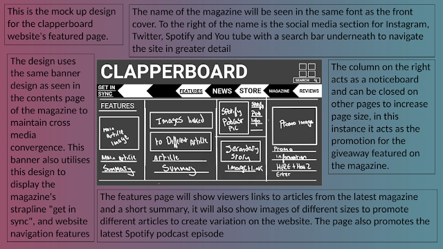
The magazine website consists of a homepage and a single linked page. This page can be accessed by clicking on "articles" or the "featured articles" section on the homepage.

Clapperboard. online

NEA Task 21 (Planning) : Photography Planning

1. Who will you be using as your models for each photograph (bear in mind that your photographs need to show representation of two distinct social groups)

The images i need to complete my magazine and website are-

  • Magazine cover 1
  • Magazine cover 2
  • Image that links to the boogeyman movie
  • Image that links to the spiderman movie
  • An image linking to Barbenheimer
  • An image linking to Netflix
  • A giveaway image 
  • Spotify podcast image 

For the first magazine cover image my model will be Bradley Hillyer as he fits the same demographics as the director Wes Anderson, a white male.

For the second magazine cover my model will be Amber Parker as she fits the same demographics as the Actor Hayley Atwell, a white female.

For the image that links to the Boogeyman article  i will recreate the poster for the movie myself using an editing software called sketchbook.

For the image that links to the Spiderman article i will recreate the poster for the movie myself using an editing software called sketchbook.

For the image that links to the Barbenheimer article i will recreate the poster for the movie myself using an editing software called sketchbook.

For the image linking to the giveaway, i will use some of the recreated images in a collage to promote how readers can upload their work to be featured within the magazine as articles, reviews or artwork for the article.

For the spotify podcast image i will recreate stereotypical thumbnails seen on the site with a microphone and the podcast name. 


2. What thought needs to be given to the following elements of mise-en-scene?

Location for photography, costume, props, and body language?

For the Wes Anderson cover i will place my model against a plain white wall as this bright will juxtapose the velvet green blazer and white button up my model is wearing as Wes is often seen in outfits like these. The model will be looking off camera facing slightly to the left as seen in the mock up cover, this will show the models serious nature however the slight smile/ smirk will ensure he is not too serious. There will be no props used as the focus of the photo is my model. I will also use a bright lighting to focus on my model who will stand out by wearing dark colours.

For the Hayley Atwell cover i will place my model in a brightly coloured jumper, to juxtapose the dark background patterned wall. my model will have direct gaze with the camera and be smiling/ laughing to convey a fun tone. I will use bright lighting to accentuate the bright colours of the models jumper. i will trial the use of a prop toy gun as this will link to the most recent mission impossible movie that the actor is being interviewed about however i believe this may act as a distraction on the main cover so i will trial photos with and without.


3. Who will be taking your photographs and what equipment will they use?

I will be taking the photographs as i know a lot about photography, and will use a camera as it can take a higher quality image than my phone. i will potentially require a tri-pod as well as some led lighting to illuminate the models.


NEA Task 18 (Planning) : Mock Up of Cover 1 and 2

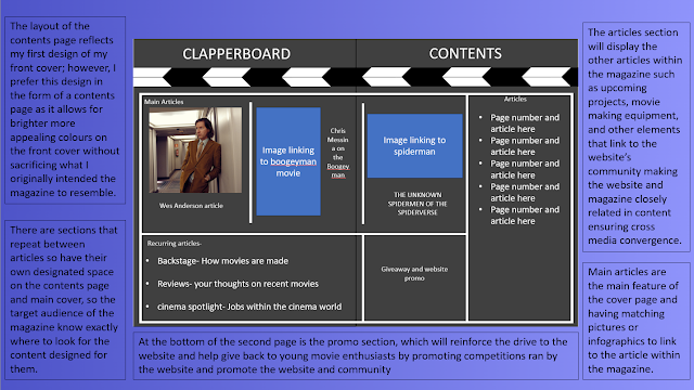
 Originally i designed my front cover to by atypical to standard magazine covers, to further illsutrate the theme of a clapper board, however i believe this style would be a better fit for the contents page so i will use it as inspiration and a basis for when i design that.


The second version follow generic magazine conventions


NEA Task 17 (Planning) : Coverlines, Images and Page Furniture

 Issue 1- June 2023

Main Coverline-

Anderson's talks Asteroid City

Other Coverline's-

Indiana Jones- The top 10 quotes

The unknown Spidermen of the spiderverse

Chris Messina on The Boogeyman

Recurring Articles-

Backstage- How movies are made

Reviews- your thoughts on recent movies

cinema spotlight- Jobs within the cinema world

Main Image-

I will use Anderson's work as inspiration for the main image with symmetry and bright colours. The image i will use will be a mid shot with direct gaze using model Bradley Hillyer as a Anderson stand in as they fit similar diversity quota's.


Issue 2- July 2023

Main Coverline-

Dead reckoning's Hayley Atwell

Other Coverlines

Barbenheimer- The world forever changes  21 7 23

They cloned Tyrone- down a rabbit hole into a sinister neighbourhood conspiracy

sons of summer- sun, sea and action

Recurring Articles-

Backstage- behind the scenes of Expendables 4

Reviews- your thoughts on recent movies

cinema spotlight- production sound mixer

Main Image-

i will aim to have a standard mid shot of the female model with direct gaze to the camera. I will use bright lighting to juxtapose the black background of the magazine.

NEA Task 16 (planning): Masthead Design

The font i am looking for must be-

  • serif
  • looks handwritten
  • legible
  • have capital and lower case fonts
  • looks scruffy
  • looks good in white and black

copykey-


starlight-


Bitcheese-


Pancake jam-

Rose Velvet-


Handwritten Basics-


Paper Flowers-


Lazy Student-


Marker sd-


I Eat Crayons-

Good Marker-


Marker Brush-


Hapsa Marker-


Casper Marker-


20 Cents Marker-

Finish-


Holigas-


The font i will use will be Finish for the masthead and lazy student for text.


Completed NEA

  Dear Moderator,  My name is Ethan . Welcome to my A Level Media Studies blog. This is a record of the work I have undertaken for the Makin...